Why Your Event Website Must Be Responsive?
At first, we need you to answer a simple question. Do you use your mobile device to connect to the internet?
At first, we need you to answer a simple question. Do you use your mobile device to connect to the internet?
Imagine getting an invitation to a conference. You tap the link in an email you just read on your phone. The site begins to load… but the text is tiny, the buttons are off-screen, and to fill out the registration form, you have to scroll sideways. How many more of these sites are you willing to tolerate?
This is where responsive design steps in to save the day.
A responsive website automatically adapts its layout, content, and interactive elements to the size and shape of the device it’s viewed on – whether that’s a desktop, tablet, or smartphone. In short: users don’t need to zoom, scroll sideways, or guess where to click. The site handles it for them.
But responsiveness is not just about looks. It’s about user experience – which means the experience of your participants.
If you organize events, you need to know that the world has gone mobile — quite literally. According to StatCounter data from February 2024 to February 2025, over 62% of all web traffic comes from smartphones. In some industries (like training or B2C events), that number is even higher.
Add tablets, which account for another 2%, and it becomes clear: nearly 2 out of 3 visits to your event website may come from devices other than a computer.
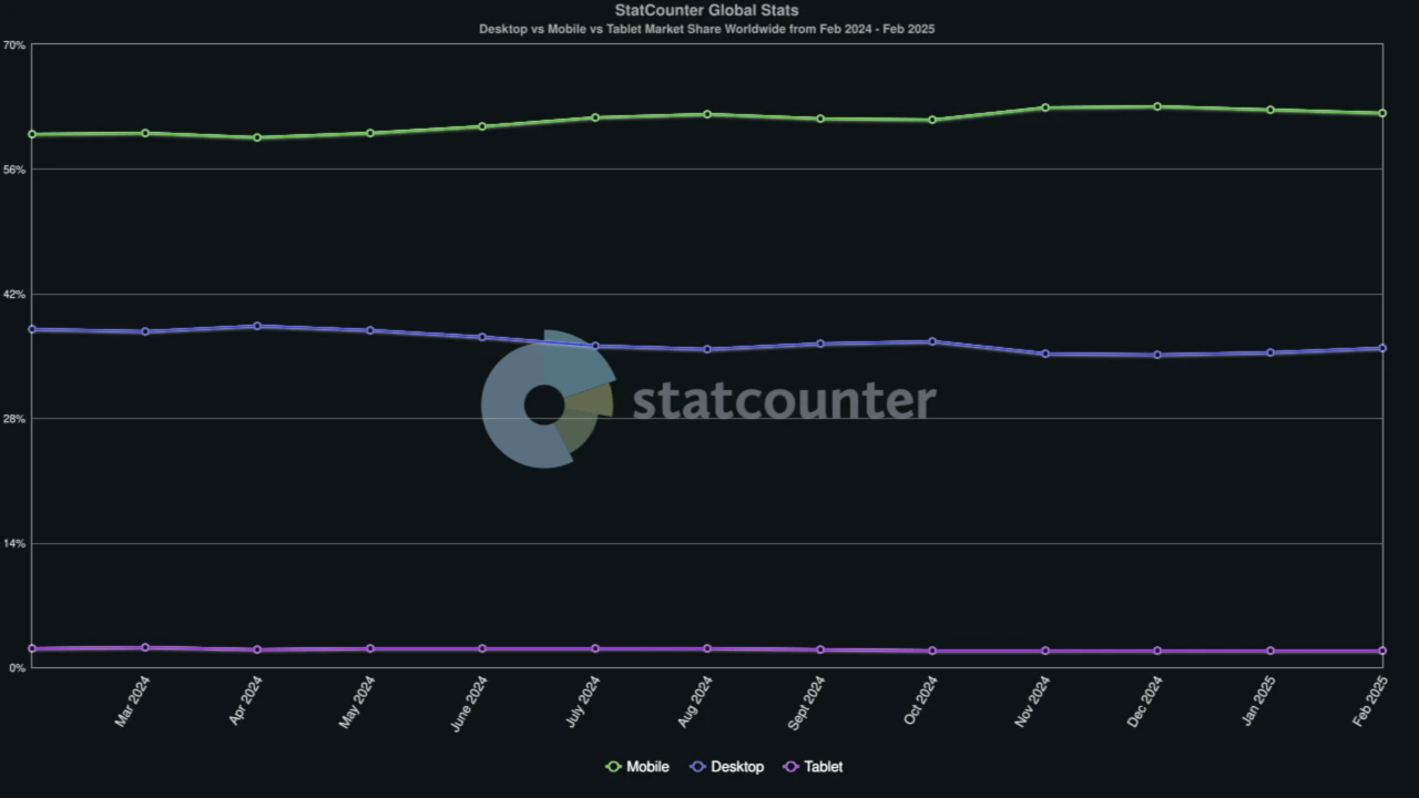
Source: https://gs.statcounter.com/platform-market-share/desktop-mobile-tablet/worldwide/#monthly-202402-202502-bar
If your website isn’t built for that – you won’t just frustrate potential attendees. You’ll lose them.
Just a few years ago, responsiveness was a “nice to have.” Today, it’s a baseline expectation. Users don’t have the patience for poorly designed pages. If your site is hard to navigate, they’ll simply leave. And with them, so does the opportunity to register.
Even search engines agree. Google prioritizes mobile-friendly websites in its rankings. That means it’s not just about how your site looks – it’s also about whether it’s even found in the first place.
With CONREGO’s built-in CMS module, you can create a fully responsive event website in just a few minutes – no developer needed. You use ready-made components that automatically adapt to any screen size, while you focus on your message.
Plus, the visual editor lets you:
This means your event earns trust from the very first interaction. And you never have to compromise.
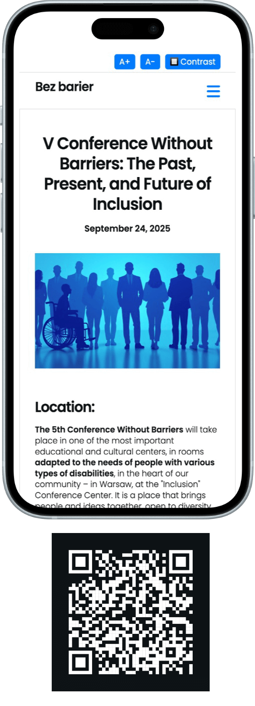
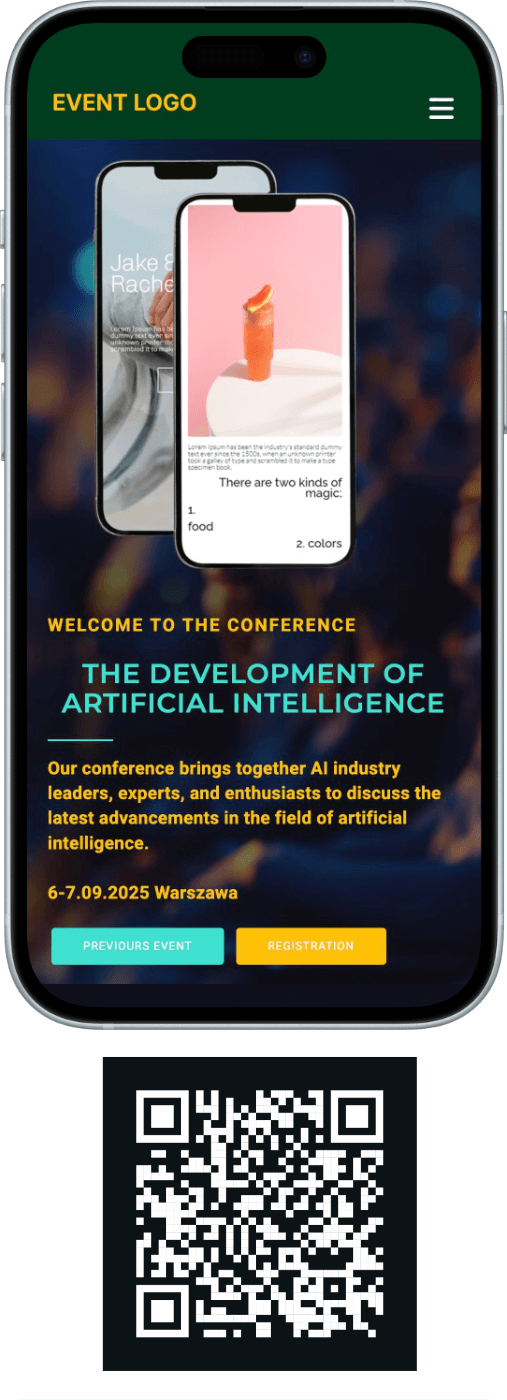
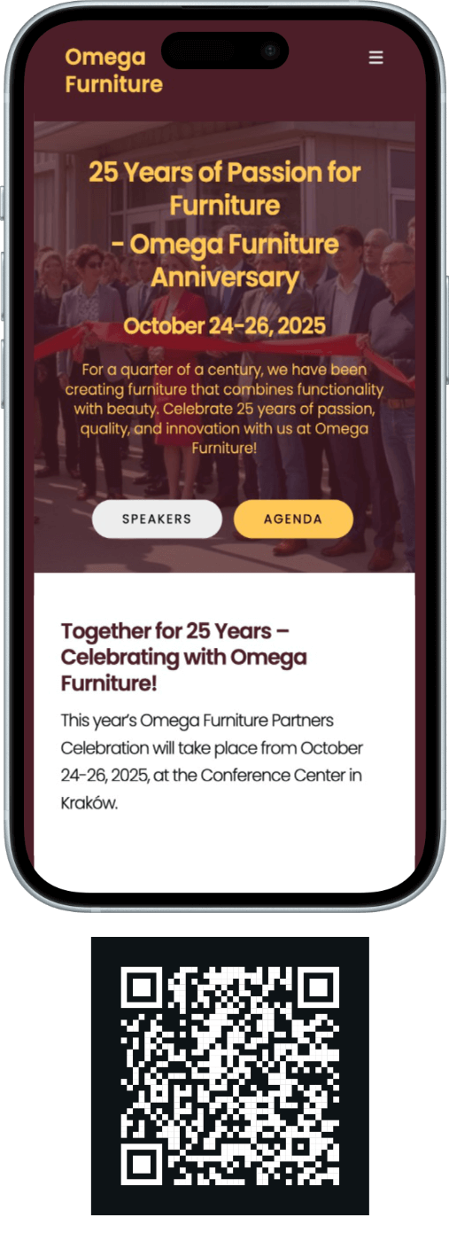
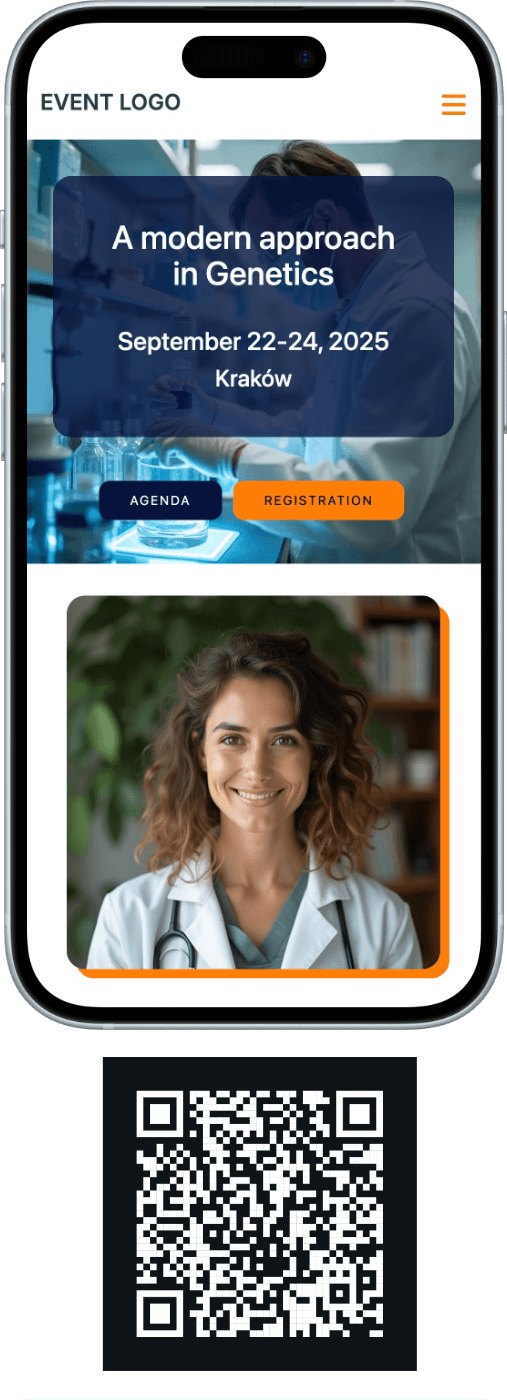
We’re showcasing four demo pages you can easily view on your phone. Simply scan the QR code with your smartphone camera or click the link below the code.

Managing Partner at CONREGO. She specializes in educating event organizers and improving communication with participants. She writes about how to simplify the work of event managers and create processes that enhance attendee satisfaction and the overall effectiveness of event operations.